The following example demonstrates how to use the Graph Widget to display live CAN data out of a List in a graphical format. A List Widget is used in this example as well to display the raw data in a tabular format. The Graph Widget is only available on displays with the M2/G1e processor and newer platforms.
Graph Implementation Overview
- Create a Custom List to contain the data to be graphed.
- Write a script to load data into the list.
- Bind the graph widget Series data to the list item
- Set the min and max scale as well as the number of data points to show
The graph gets its data from a Custom List which is essentially an array of data. There are four series that can be configured for display on the graph so the list will contain a column for each series you wish to display. The data source for each series is bound to the column item in the list from the Graph properties in the Page Designer tab. 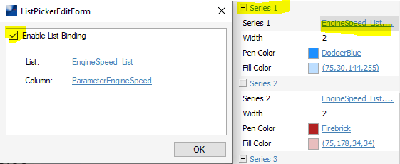
The number of rows you select when building the list will be at least the number of points displayed on the graph. The Y axis of the graph is set by the min & max settings in the graph parameters. If you have one parameter that has a really high scale value such as engine speed and another parameter that has low values like engine temperature it will not display very well. To "zoom in" on the smaller value series create a x10 variable and display it instead and manually add a second y-axis for the re-scaled parameter. 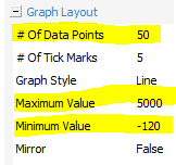
A script routine is used to take the incoming J1939 data and populate the list with data every second.
A list widget has been added so you can see the data in the list. Swipe up with your finger to see the latest data added to the list.
To use this example simply send engine speed, engine coolant temperature, and percent load. The example was created in version 4.717 for a PV780B.
Comments
0 comments
Please sign in to leave a comment.